Thursday 19 May 2016

A Fur Baby Bereavement Card.


This card was a very quick card for a very lovely family that had to have their beloved dog put to sleep this week.
It is such a sad thing to have to say goodbye to a pet of any sort, but losing  a dog is especially upsetting. They become family members and you love them as you would a child,  and they love you back unreservedly and unconditionally They seem to know your every thought and understand your mood, if not your every word.  They are not just pets, they are our fur babies.

Sometimes I think it's harder to lose a  good dog than a friend or some relatives. That may sound a little harsh, but for me it's true. I still get very emotional over losing my King Charles Cavalier, who I lost 9 years ago. But I don't get as emotional over the  death of some of my relatives now.
Maybe because I  was closer to my dog than to the relatives that have passed away.

This card was created using a Lili of the valley stamp called  "Man's best friend". It's a gorgeous stamp and I love colouring this image with my copic markers,
The die cut frame is one section of the Madison Square die set by Sue Wilson. I bought the die purely for this section of it. I am not to keen on the other parts of this die set.
The sentiment is from  the "So Sorry" stamp set by Stampin' Up,,, (now retired). I used it with S.U 's whisper white craft ink.
I added an insert  with my condolences on the right of the insert and a very touching poem on the left which is sure to make any dog owner cry.


Sunday 17 April 2016

Die storage and colour coding system

I am going to be talking about die storage today and sharing my system.
I have seen that lots of crafters store there dies on magnetic sheets stuck to the inside of cupboard doors or on boards mounted on walls.
I don't have any wall space to  do that and I don't trust magnetic sheets enough to stick them on the inside of cupboard doors. I feel they would all drop off the moment a door was closed too hard.

I know some people store theirs on magnetic sheets placed in page protectors and stored in a file.
I think this is a neat idea and saves space, but it's not for me. I am so ditsy I'd probably lose the file along with all the dies. 

Also I don't like the idea of searching though loads of pages to find the die I want and worse still finding that same page when I need to put them away.

So I thought I'd share my system, it's worked for me for some years now and I haven't lost a die yet and I don't spend huge amounts of time looking for the die I want to use.

Some years ago I bought 50 boxes for crafting projects. it wasn't long before I realized these boxes would be great for storing all sorts of crafting items.
I have to say these boxes are exactly the same as the boxes Stampin' Up  sell their clear and polymer stamp set in.

I line them with magnetic sheets and place my dies in them. If the packaging has a picture of the die on, I will cut the packaging down to fit the inside front cover of the box.

If I am putting two sets in the box I will put a picture in the back cover too. (See picture at top of post)

Then I type a list for all the boxes,  naming  the brand, the name of the die or the type of die for each box.


To make it easier to find the sets I want,  I have colour coded the brands.
I can generally remember the brand of the die I want to use, even if I can't remember the name. So all my Spellbinder dies are labelled in white, X cut dies are pink and Go Create are blue and so on.
I use a different colour for each brand  which makes it so much quicker to find the set I need.

Sometimes I will put two of the same type of die in the same box, even if it's a different brand...ie  circles. 

Of course these boxes are the same size as DVD boxes so finding a storage shelving for them is easy, inexpensive and doesn't take up much space in your craft space. Some of mine are stored in a dvd shelf unit and others are stored in a drawer spine facing up of course.

Friday 15 April 2016

Monthly Swap Card

 I sometimes participate in a monthly card swap. 
This is the card I have made for this months swap.

This had to be a quick card as I have a load of stuff to do and make over the next couple of months.

This is a design I would use in one of my hidden hinge scrap books. I like the design, so I thought I'd try and scale it down and try it as a card.
I started this card by stamping the background paper using Always Artichoke ink on a shimmery olive green paper. 

The pretty band across the centre was  created using  Spellbinders Curvy Borders 2  dies twice. Now this takes a little bit of practice to get the design  to match up on both sides .

After cutting the lacy edges I used one of the less fancy dies to cut the pretty paper panel that runs through the middle. Again this takes a little practice  to get this even and match up with the lacy layer.
Even with measuring and taping dies down before cutting I found it could still be slightly out. 
Hence the bling to hide or distract from  any
unevenness.
I bought some bling ribbon and cut it into strips. I then ran a flame very quickly along the edge of the strips to melt the threads back to make it look neater. 

This stuff looks like it's encrusted with diamante, but it's not.  It's just hundreds of tiny cups that have a faceted inside and a metallic coating, which makes them sparkle a lot and giving the impression of thousands of tiny diamonds. It is obviously much lighter in weight that the real diamante so you can use loads of it on a card without worrying about how much it will cost to post and of course it's a faction of the price of the real thing. 
I think,  I paid 59p  for two metres but if I cut it  into single strips i'll have 12 metres.


I had bit of  an issue with glue attaching the bling to the card but managed to rectify it by using
Art Glitter glue..I have to say this is pretty good stuff...grabs quickly so you don't have to sit  holding things together  for ages waiting for the glue dry.
The flower I made using Heartfelt creations Arianna blooms stamp and dies. 

The leaf die I used for these leaves is from the Heartfelt creations Delicate Asters die set. The last thing to add was the stamped  and die cut sentiment. 
Well,  this card is off to Suffolk in the morning I do hope the recipient likes it.


Thursday 7 April 2016

Hidden Hinge Memory Book Under Construction.

This project is still under construction. 
It's taken me the best part of two days to get it this far and there is still a lot of work to do on this project.

Unfortunately, I forgot to take photographs of the construction of the book cover and making the pages, so that should make this post a little shorter.

I started this memory book to teach a friend how to make them.
The idea was that she would follow me as we made them together.
We did the cover and the hinge on Monday, but Tuesday she was stricken with a bug, so she has not been able to complete her book.

Once I start a project, I like to keep going with it until  it's finished. So I have continued with this project without her.


I usually make these in black card,  but this time I decided to try cream card as I am contemplating making one as a wedding gift and I wanted to see how it turns out before I commit to doing the wedding album. 

So far the disadvantage of the cream card is that any smears of glue show up quite badly. I know Tom bow can be rubbed away,  but it does take quite a bit of effort to get every trace of it off.   If you don't get it all off it attracts dust, glitter and all sorts of small particles, making the card stock look grubby long before the project is finished.

So this the basic book. It has five pages, which may not seem a lot if you have never seen one of these books before you won't know just how much stuff they will hold.


Each of the five pages has at least one hidden pocket to conceal lots of photo boards 
or mini photo books.

The flip out pages also have places to add photo books tags, journalling, photo mats,  small keepsakes and embellishments. 
In fact these books hold so much it's sometimes difficult to find enough stuff to fill them.
This is the inside cover and first hidden pocket page.

The flap you see in the photo conceals the opening to the large pockets and will have magnetic tape or strong magnets attached to keep the flaps closed when turning the pages and to prevent items falling out of the pockets.

I have punched fancy edges into some of the flaps for extra interest.


In this photo  you can see I have used large strips of magnetic tape.  
This tape isn't very strong which is why I have used large pieces.
I will also use paper as opposed to card to cover the magnetic tape.
The thicker the paper or card covering the magnetic strips the less attraction they have meaning the flaps will flap.


In this photo I have added very thin strips of decorative paper to the outer edge of each page.
I am not sure I like this effect, but it's something I haven't tried before and  I love to try different techniques.
It also creates glue issues.
In the next photo you can see one of the flip out pages.

The shot below shows the same flip out page covered with decorative paper.

The papers I chose are, The William Morris collection , from Joanna Sheen. I have to confess I bought these papers at least ten years ago. I didn't like them when they arrived and threw them in a drawer. That's where they have lived ever since. Until yesterday that is.

I have totally changed my mind on these papers now. Well apart from three of the designs that is.
So I have mixed in some other papers to complete the book.
In this next shot you can see  the magnetic tape covered in paper. 


You can also see the notch I punched out to make accessing the photo board easier. This was created  by using a 1" circle punch to cut the semi circle out of the cream card.
I used a  1  3/4" punch to cut the larger semi circle from the polka dot paper.
The back inside cover of this book has a fancy packet which will hold either a booklet or some large tags.

I am  contemplating adding a waterfall mini album to the left hand page  on the shot below.
This little pocket has not been stuck down yet, I am undecided on this at the moment so, I'll hold off on this untilI have decided what I can put with it on the corresponding pages.

Well that's all for tonight I will post more pics  when the book is nearer completion.

Wednesday 6 April 2016

Mini Embossed Faux Leather Booklets

Here is something a little different and would make a nice gift or would be perfect little booklet to put in a scrapbook.

I made these after watching a video on Youtube by Sheena Douglas.
Sheena used distress inks on craft paper, but I don't have either of them so I tried the technique with S U inks and card.  Sheena also uses Spray and Shine to finish off the leather look. I don't have that either so I used what I have.

I used S.U s crumb cake card stock. Half an  A4  sheet for a small booklet.
I mixed about one tablespoon of gylcerine with roughly 1/4 of a pint of water in a small spray bottle. 
I sprayed the card well on both sides and gently crumpled the card stock into a ball.
I repeated this several times until the card was very soft and pliable.  The softer the card gets the easier it tears, so you have to be really careful each time you open up the wet ball of card.
Once the card was creased all over I used an embossing folder to add the embossed pattern. 
The card is too big to emboss it all in one go ( unless you have A4 embossing folders) so you have to emboss one half then do the other half.
Now you need to let it dry.
I draped  my card over the radiator and cranked the heating up for ten minutes to speed up the drying time.

The next step is to apply two complimentary inks to the cards stock.  


 I used Soft Suede and  Lucky Limeade on the tree booklet.


Early Espresso, Baked Brown Sugar and Tangerine Tango on the other two booklets along with a touch of red on the Birds and Swirls booklet.

Now at this point I had to find an alternative for the spray and shine.
I used a matt finish acrylic varnish used for varnishing paintings. There is no shine on this booklet, but I really like the look and the feel of this one. I tried crystal effects,  but that required so much brushing to spread it out evenly,  it disturbed the ink so much it looked very muddy and the effect was lost.
I then tried Mod Podge, if you like very glossy leather then use Mod Podge. 
I applied a thick coat of  Mod Podge with very little brushing so not to disturb the inks too much. 
The finished result was a very glossy, almost plastic looking card stock that feels quite durable. But personally, I prefer the  Matt Acrylic varnish look. 
The beauty of the Spray and Shine is, it doesn't move the ink about as much as brushing on a wet varnish. once the varnish has dried glue a piece of cotton fabric to the reverse allow to dry completely, then trim back the fabric and card stock. Punch the corners to round them off.   Stitch the pages into the book through the cover.
Go to youtube to see Sheena's tutorials on faux  leather. 
Sheena also shows you how to stitch the pages into the book.
I think, this project could be taken a step further to make this even more professional looking by making a pocket using the same technique to protect the book while in your handbag.

Gilded Flying Scotsman

It's been a while since I have updated my blog, that's because I haven't done any crafting for a while. The reasons for that being  four weeks ago,  I fell down the stairs and badly sprained both ankles. 
Hubby took me to hospital some hours later, when the pain got so bad I could barely stand, let alone walk.
Hubby found a wheelchair and wheeled me into A&E, where we sat and waited for hours to be assessed & Xrayed and finally to be seen by a male nurse, who not only gave me a pair of crutches, but he also gave me his cough when he coughed in my face and continued cough over me through out the whole consultation. I knew I wasn't going to escape getting his bug from the first cough. 
Sure enough, two days later I started coughing,  I coughed so much and so hard I gave myself the headache from hell and had pulled all the muscles around my ribs. 
After a few more days things went from bad to worse, I lost my voice and became feverish and I really felt like crap. So I spent the next few days and nights camped out on the sofa. So as not to give it to the rest of the household or keep them up all night. 
The annoying thing was, I couldn't use the crutches for more than a couple of minutes as  it put too much strain on the shoulder I injured when I fell over at the end of last year and had recently finished a course of physio for. 
Once the ankles had recovered enough for me to walk, my brother in law took me to the doctors, she told me I had a chest infection and signed me off work and gave me some pills. 
So now you know why I haven't been up to crafting a blogging for a while.
But I have certainly made up for it the last couple of days.
I am sure  you haven't come to  y blog to read all about my health issues, so I'll get on with with my first crafty post.

My first post this evening is a card I made for my dad. It had to be a simple card as I am not fully recovered for my illness and injury.


I bought this Robert Addams die at the Make it show this year. It's called the Flying Scotsman.
It's easier to make up than his motorbike die. 
Robert had samples of the die made up in gold  Mirri board and in coloured card which looked great, but I wanted to try something a little different with it.
So I made up the train in black card,  then applied gilding wax over the card. I think it's very effective.

The Age Awareness sentiment is from
a stamp set with the same name.
I stamped the sentiment and heat embossed it  then used gilding wax over the  heat embossed sentiment to tie it in with the train and background.

The world map is an embossing folder available from stampin' Up.  Sorry I can't remember the name of it.


Friday 11 March 2016

Sharon's Christmas Card 2015

Here's a great card made for me at Christmas by my friend Sharon.
I have been meaning to post this one for some months, but I kept forgetting where I put it.

Even hubby liked this one. He  especially likes the punched stars across the bottom.
He asked "have you got that punch?"
I said, NO.
He said "you better get that one then".

Well, I don't need to be told twice to buy something crafty, so I bought it on the very next order. I just haven't got round to using it yet.
If I remember rightly it's one of the confetti punches called stars.

A Couple of Baby Cards


I found some time to play this week and created this card for a  pregnant friend.
Her new baby is due any day now, so I thought I'd be prepared for the arrival.

I used the  retired "Two by Two" stamp for the image and coloured it with Copic markers.

I used S.U s  Blushing Bride DSP for the background.


I enjoyed making this card, so I made it again. This time I made my own background paper for this one.It turned out a little darker than I wanted, but it still works.

If you want to know how I made my background paper, take a look at the tutorial a 8 posts below.
The ink colours  I used this time are, Pool Party and Lost Lagoon.


Hubby doesn't like this one.  It's too pale and plain for his tastes.
I think it's pretty and feminine without being fussy.

I used a large background stamp called "I love Lace". It's a retire stamp from Stampin' Up.
It's a beautiful stamp perfect for girly cards.

I stamped the lace image  with Versamark ink and heat embossed  it using white embossing powder.

I die cut a couple of ovals for the sentiment.

I added a bow in the same colour ribbon as the card, but the lighting at the time of the photo makes it appear more peachy than pink.

The sentiment stamp came from another retired stamp set called "Sincere Salutations".

Monday 7 March 2016

Alison's 60th Card

This step card was created for a lovely lady who turned 60 last week.

I use Pool Party card stock for the base card and this gorgeous Birthday Bouquet designer series paper..I love this paper so much I bought a couple of packs of it and I may even get some more. 

Regular readers will know how much I hate working with photo polymer stamps and those of you that are familiar with the stampin' up catalogue  will know the stamp set I used to decorated the oval panel is a photo polymer set. 


I have to say that for once, this was certainly an advantage.The " Look who's turning" stamp is a shaped in a arc, but the arc wasn't quite curved enough to fit my oval die cut. But being a photo polymer stamp meant I could pull the ends of the stamp in  until it fitted my die cut. I have to admit the stamps I have used so far have actually stamped   quite well too. The stamp set is called " Number of years".

Mini Cards


I
Today's challenge:  To use  scrap card from the scrap box only, even for the base card.


This proved to be quite difficult as most of my scraps are much smaller than half an A4 sheet, 


So these are very simple mini cards.
I used the S U stamp set called "making a point."  and "Bordering on Romance"
I like the images in the "making a point" set, but I am not so sure about this particular sentiment.

Copic markers are my  favourite markers to do my colouring although I do on occasion use stampin' up stamp and write markers.


Sunday 6 March 2016

A Couple of Masculine Cards.


It was a poor nights viewing  on the TV last night,  so it was a good time to sit down a down and do a spot of colouring.

So I  stamped off a dozen images from a variety of SU stamp sets and sat down down with a big box of markers and began colouring.

This morning I had a nice little stack of coloured images ready to be turned into cards.

The first card is a tent style card and was made using the duck from  the Wilderness Awaits stamp set.
I was pleased with my efforts on this image.    The colours are a little stronger in reality than in this photo.

For base of the card, Instead of using lots of layers for the background. I used my square dies to create a Night of Navy card frame and a Pool Party square that fits exactly inside the navy frame.
This saves on card and reduces the overall weight of the card.
I did mount the duck onto a square of Navy for the panel.
For my second card I used the dog from the same stamp set.
You can't see it very well but the image is mounted on a piece of night of Navy card stock, then onto a piece of Night of Navy designer paper. The sentiment is from a stamp set called Riveting, the stamp has a small flower in the centre, which was not appropriate for this card, so I punched out a small circle of the DSP to cover the the flower.

Monday 29 February 2016

Gilding Wax Card

This is my first card using my new die and gilding wax. For this top one I used all three colours of gilding wax and  applied it using a  streaking motion  and the lightest touch across the die cut.


Here I have die cut the three kings and streaked gold gilding wax over the die cut and added a piece of shimmery blue paper behind, I am not sure I really like this, but I have included the idea anyway... I think I have some more playing to do with this die.

Experimenting with Gilding Waxes.


Another of my purchases from the the show this weekend  was three pots of gilding was. 
My only experience of gilding was is the  Rub and Buff stuff you apply to furniture etc.  
Which I have applied to cards in the past with varying results. 
So when I saw these  Pebeo  gilding waxes at the show on a buy two get third free offer, I couldn't resist.
Today I had try them out.  
 I cut some black card and embossed them using a variety of embossing folders. Then applied the gilding waxes. 
Silver on the cobweb  and a mix of gold and copper on the other two.

Saturday 20 February 2016

Stamping Problem.

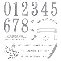
This is one of this year's salebration stamp sets.
I have to say I have had more than a little trouble getting a good solid image with this large  greeting stamp.   (I have the wood mount version of this set.)

I know I am not the only person to have a problem with this stamp.

So today I decided to experiment with ink pads  and card stocks to see if I could get a better image.

Well, the short answer is yes I did manage to get a good clear solid image eventually, but it wasn't easy.

I tried my normal ink pads, which generally work perfectly well and found they were no good for this stamp. So they had to be re inked before my second attempt at stamping with them.

 So then I tried the new style stampin' up ink pads as they release more ink onto the stamp, therefore giving better coverage.

I was a disappointed to find  a couple of new pads were still too dry for this stamp. I tried using a foam pad under my card stock  before stamping the second image and still got a poor result.


I tried another more juicy ink pad  and  again I used the foam pad under the card stock.  Although I got a better result this time,  there were till areas that didn't stamp.

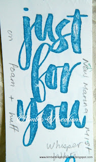
I tried to touch up the missed areas with the matching marker pen. As you can see the marker pen shows up a lot.


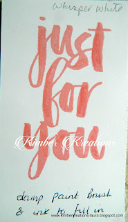
So I stamped it again using the same ink pad and foam, again there were misses but this time I touched up the missed areas with an aqua painter and a little ink. The result was much better, but still not  quite good enough for my liking

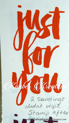
My next step was to sand the stamp lightly  with a fine grade sandpaper and try again.

This time I stamped the imaged with a  brand new, unopened, and much juicier ink pad and without foam pad under the card stock.
The result was better, but still not perfect.


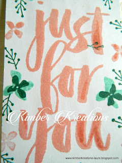
 I  then decided to give the stamp another  sanding, this time a little harder and mainly working on the thick downward strokes of each letter. As these are the areas of the stamp that are giving me most grief.  

This time it produced a pretty good, solid image  one that I would be happy use on a card.

I also tried stamping this image on three different white card stocks.

Photocopier card, I sometimes use  this for stamping and usually get reasonable results but for this, the results were very poor.
I tried chameleon card stock, which I use to stamp images on that I want to colour with alcohol markers. The results were not good.

Then I used my favourite  card to stamp on,  Whisper white card stock  from S.U.

 My Conclusion,  in my opinion  the best way to get a decent  bold, sold image with this stamp is to sand the stamp well, especially the thick, downward strokes of the letters.

Use a foam pad or old mouse mat under your card stock.

Use a very juicy ink pad to ink up the stamp, use enough ink on to form tiny beads of ink evenly over the stamp.
But beware of putting too much on and creating pools of ink.

My final tip is to press the inked stamp onto the card  firmly and hold it in position for  around 10-15 seconds to give the paper time to absorb the ink from the stamp.

If all this doesn't work for you,....... give up and throw the stamp away and make a cup of coffee.
No, seriously you could always  resort to  heat embossing it instead.
I have to say in my six years with Stampin' up,  this is the first stamp I have ever had a problem with.


Friday 19 February 2016

Thank you card


Okay,  so I had to use up the background paper I made for the tutorial in yesterdays post. 
I stamped and coloured this image some months ago, but never got round to using it. I found it while tidying my work space his morning. So I made this card instead of finishing my tidying it.
It's a smaller card than I usually make, It's  about 3 x 5 inches. It's  a cute little card, if say so myself. Unfortunately it didn't photograph very well and this photo doesn't show it in it's true colours.


Birthday Bouquet DSP


Don't you just  love this pretty paper. I love this paper so much I've ordered a couple of packs of it. but don't tell Hubby, Ha ha ha. This DSP pack is called Birthday Bouquet. 
The stamp set I used to stamp the greeting is from this years  Sale a bration  brochure. 
You gotta love  free stamp sets.

Textured background paper tutorial.


I spent last night colouring these  images while watching TV.   Today,  I thought I'd make them up into quick cards before I lost them.      
But first, I had to make my own background paper fr these images.
I wanted to create something quick and simple in different colours,  but  using the same technique, so the set of cards were not only linked  by the fruit and veg theme but by the background paper.  


The fruit and veg stamps are a set from S,U,  I can't think what they're called  exactly.... something like  "Market Fresh"  I think.

This technique is so quick , simple and effective it's unreal.
 Even Hubby was impressed with this effect.

I loved coloring the strawberries, but I am not sure what occasion you would use this sentiment for other than to label a basket of fruit.
 I think I will have to start playing around at masking the sentiment off and adding something more usable.

I used a brayer and light coloured ink  and roughly covered a piece of white card stock with ink.
I didn't worry about the evenness of the ink. I thought being uneven it may add extra depth to my  work.


I then  used  a retired S.U. wheel stamp called "Texture"  and using  a navy ink I ran the wheel over the top of the card stock in every direction over and over again, until I had the effect I was looking for.


Here are three pieces, two were  done with the same colour inks.  
Bashful blue and Night of Navy.

The last, darker piece was achieved just by adding more of the navy ink then adding a little  purple ink   "Concorde Crush"with the texture stamp. 
Which gave the blue a richer, deeper look. 


I rather like this colour combination,  it remind me of denim  jeans.