Independent stampin' up! demonstrator uk, since 2010 Handmade cards, Rubber stamping, stamping techniques, card making ideas, Stampin' up Stampin' up, card making inspiration, scrapbooking, papercrafts.

Showing posts with label kimber kreation. Show all posts

Thursday, 14 April 2022

Golden Egg Card


I 've left making most of my Easter cards to the last minute again.  So I needed to come up with something quick as they need to be in the post tonight. 


As I was searching through my scrap drawer I found a piece of card, out of which I had die cut an egg shape. I started wondering if it would make a good  stencil. So I decided to give it a try.  Sometimes you get a fuzzy edge when using die cuts as stencils.

I taped the negative die cut  on to a card panel and blended ink through the aperture. I then placed a decorative stencil over the top and brushed more ink over the stencil. The  blue and pink versions below were the first attempts. I mounted the blue one onto blue card before adhering it to the base card.

I got a bit more adventurous for the yellow one. After applying the yellow ink and allowing it to dry thoroughly, I used a sponge dauber and dabbed Versamark ink through the decorative stencil and heat embossed in gold. Applying the versamark is more difficult to apply due to the sticky nature of the ink. When dabbing with the dauber and versamark the stencil  tends to lift , so you have to be really careful not to move the stencil.  I would also recommend using a mucky versamark pad as it's easier to see where you have been.

To add the ribbon, I cut a slot along the edges of the egg on both sides. I threaded a piece of ribbon through the slots and secured at the back. I used a length of invisible thread and tied it  tightly around the middle of the ribbon to pinch in the centre. I adhered a double bow over the thread.

 To give the impression of a pink and navy layers,  I dipped the edges of the card panels on the ink pads. I added a few tiny sparkles to the pink one. 
The pink  and blue cards  were  pretty quick to make so you could do a few in next to no time. 
Applying the versamark  through the stencil is more difficult and requires more time and patience.

Thursday, 23 September 2021


It's not often you get something for free but this stamp set was a freebee from Stampin' up during the Sale a ration period. It's called feels like home.
I am disappointed with the sentiments that accompany this lovely image. I really think they should have included a sentiment or two that would be appropriate for new home cards.
Instead they have included  sentiments like... missing you, thank you, a friendship quote and another bizarre quote.  I don't think any of them fit with this image. Stampin' up do not have any stamp sets that include images or words suitable for people moving house and I am  feeling they have missed an opportunity to include such sentiments.  So I  resorted to typing up a couple of my own sentiments for these cards. Well that's my little rant over.... I guess I should say I coloured I didn't find this the easiest of images to colour, even with my trusty Copics. There is an awful lot of fine detail in this image.
I used a  fine white posca pen to add highlights and  the tiny white blooms.
You may also notice I extended the brickwork out at the sides. to do this I used the chisel tip of the marker pen as a stamp to create the extra brickwork.


Friday, 4 June 2021

Stencilled backgrounds.


 In the ten years I have been writing this blog, I don't think I have ever done a card using stencils.  Stencils have always been my nemesis. I think that's because they always seem to move as I apply the ink. It doesn't seem to matter how well I secure them down, they still manage to move. So I gave up on them... 

until now that is. I was wandering round the Range looking for envelopes, yellow beads and A3 heavy white card. Well I didn't find any of the items on my list but I did spot some small packs of  animal print stencils and a pack of  spots and stripes.   Going against my better judgement, I decided to give them a shot. Well they were only  £1.00 a pack, so I didn't have much to lose if I couldn't get on with them. After playing with these stencils I have come to the conclusion my problem has been my stencils   are mainly  narrow stripes  and very large stencils,  making them very flexible. Too flexible for my heavy handedness. 


 I was delighted with the out come using the giraffe print.  So much so I just had to combine it with the giraffe stamp  on the card below.  It also works well when used with stone colour inks to create a stone wall. As on the header card with the grapes on. I have tried the others stencils in the packs and found the animal prints and spots are easy to work with too, but the straight and diagonal stripy ones are still an issue for me. I  haven't won the battle  with stencils completely. But I am happy with what I have achieved so far.


Saturday, 18 July 2020

HAPPY BIRTHDAY YOU OLD GOAT.


I wasn't sure about this set when I first saw it in the catalogue.   The  Goats are pretty cute
but I doubted my colouring ability.    After a long debate with myself,  I bought the set.
 Here I have used pale greys to add depth to these white goats.
I may try adding some  patches of colour to these comical creatures at a later date to  see how they turn out.

Monday, 27 November 2017

This Little Piggy.

A quick little card using the Burlap background stamp and this cute little piggy from the current S.U catalogue.
This little piggy.

Here I have put Baked Brown Sugar ink  and Blackberry Bliss  Card stock together.

For the flower,  I punched out two layers of petals shaped them and added a tiny gem stone.


Saturday, 20 February 2016

Stamping Problem.

This is one of this year's salebration stamp sets.
I have to say I have had more than a little trouble getting a good solid image with this large  greeting stamp.   (I have the wood mount version of this set.)

I know I am not the only person to have a problem with this stamp.

So today I decided to experiment with ink pads  and card stocks to see if I could get a better image.

Well, the short answer is yes I did manage to get a good clear solid image eventually, but it wasn't easy.

I tried my normal ink pads, which generally work perfectly well and found they were no good for this stamp. So they had to be re inked before my second attempt at stamping with them.
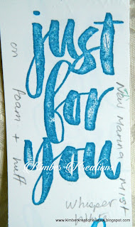
 So then I tried the new style stampin' up ink pads as they release more ink onto the stamp, therefore giving better coverage.

I was a disappointed to find  a couple of new pads were still too dry for this stamp. I tried using a foam pad under my card stock  before stamping the second image and still got a poor result.
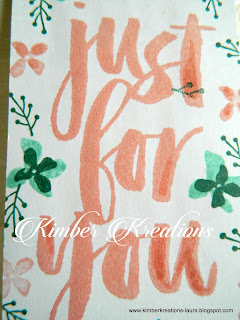

I tried another more juicy ink pad  and  again I used the foam pad under the card stock.  Although I got a better result this time,  there were till areas that didn't stamp.

I tried to touch up the missed areas with the matching marker pen. As you can see the marker pen shows up a lot.
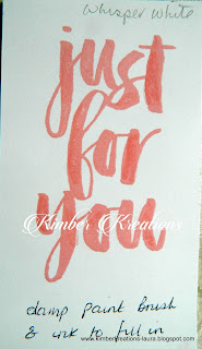


So I stamped it again using the same ink pad and foam, again there were misses but this time I touched up the missed areas with an aqua painter and a little ink. The result was much better, but still not  quite good enough for my liking

My next step was to sand the stamp lightly  with a fine grade sandpaper and try again.

This time I stamped the imaged with a  brand new, unopened, and much juicier ink pad and without foam pad under the card stock.
The result was better, but still not perfect.


 I  then decided to give the stamp another  sanding, this time a little harder and mainly working on the thick downward strokes of each letter. As these are the areas of the stamp that are giving me most grief.  

This time it produced a pretty good, solid image  one that I would be happy use on a card.

I also tried stamping this image on three different white card stocks.
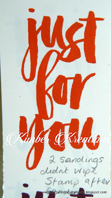
Photocopier card, I sometimes use  this for stamping and usually get reasonable results but for this, the results were very poor.
I tried chameleon card stock, which I use to stamp images on that I want to colour with alcohol markers. The results were not good.

Then I used my favourite  card to stamp on,  Whisper white card stock  from S.U.

 My Conclusion,  in my opinion  the best way to get a decent  bold, sold image with this stamp is to sand the stamp well, especially the thick, downward strokes of the letters.

Use a foam pad or old mouse mat under your card stock.

Use a very juicy ink pad to ink up the stamp, use enough ink on to form tiny beads of ink evenly over the stamp.
But beware of putting too much on and creating pools of ink.

My final tip is to press the inked stamp onto the card  firmly and hold it in position for  around 10-15 seconds to give the paper time to absorb the ink from the stamp.

If all this doesn't work for you,....... give up and throw the stamp away and make a cup of coffee.
No, seriously you could always  resort to  heat embossing it instead.
I have to say in my six years with Stampin' up,  this is the first stamp I have ever had a problem with.


Friday, 28 November 2014

Snow Scene in Purple.

I got bored with blue and wanted to try another colour, so I chose my  favourite shades of purple for this one.  Apart from these colours being  my favourites another reason I chose them is because  I remembered  many years ago all the photo's I took out and about in the snow always had a strong purple hue about them, so it seemed a natural choice.

I used SU's classic ink pads in Concord Crush and Almost Amethyst  both of these  colours have been retired unfortunately. Hopefully one day they will being them out of retirement so I can top up my cardstock and ink refills in these colours.

As you can see I added a moon to this card for some variation.
I also stamped the trees in black rather than green..
The black I ink I used  is from SU again  and it's the CRAFT ink not the classic. 
The ink is a pigment based ink which is much slower to dry  but the black is so much more intense than standard  dye based ink pads.

The instructions for this card are exactly the same as in my previous tutorial apart from adding the moon.

So I will just add a  few instructions for the moon

As in the  tutorial below,  stamp over the white card stock with Versamark clear ink and allow it dry off a little. 
If you don't own a small splatter stamp, try using a versamark pen and drawing dots and small spots over the card stock before you begin inking.

Sponge over the sky area lightly with  light coloured ink. It doesn't matter if your sponging is a little patchy it adds to the effect.

Punch out a circle  from scrap card or heavy paper ( this will be your moon mask ) 
I  strongly recommend you use  a two way glue pen and apply a little  glue to the moon mask and allow it to dry thoroughly. This will prevent your moon mask from moving as you work,  so you should get a nice crisp outline on your finished  moon.

Position your moon mask in the area of the sky where you want your moon to be. 
Position your snow drift mask (see tutorial below this post) over the lower part of your moon mask and hold firmly in place.

Ink up your sponge in the same  light colour as you used for the sky and  begin applying the ink starting in the centre of your moon mask and working outwards and skywards, gently onto your cardstock  around the moon mask and along the snow drift mask.This will create your horizon.

 (DO NOT INK  around the bottom of the moon mask if you want your moon to be partly hidden by the snow drifts.) 

Keep applying ink in the same manner until the colour has built up enough around the edge of the masks to give you a well defined moon. and horizon. 
Carefully remove the moon mask and start sponging your snow drifts. 


Tuesday, 18 November 2014

Inked Snow Scene Tutorial


 These cards have been much admired so I thought I would share the technique with you so that you too can make this card.
 Except it won't be this card as no two cards come out the same.
Which makes everyone unique.

The tools and materials used are very basic.

2 shades of blue ink 
2 sponges or daubers.
1 dark green ink pad and matching marker if possible (just incase)

Versamark clear ink pad

A pine tree stamp and a splatter stamp

I have used the pine tree from the Stampin Up  " Lovely as a Tree" stamp set.

and the splatter stamp from the stampin up "Gorgeous Grunge" set.

4x4  Whisper white card stock,   (it's so smooth and easier to sponge on.)

Scrap paper cut  a long curvy line across it. 

Lastly a glue pen and some Dazzling Diamonds glitter.

Let us begin....

 Ink up the splatter stamp with clear versamark ink  and randomly stamp the the top half of your white card and allow the ink to dry.  ( about 10 mins)

You won't see very much  on the card at this stage as the ink is clear.
 Cut a curvy line across a sheet of scrap paper. I am using a mask I have used before so you can see it.

This is going to be your mask for  creating the drifts of snow and I will refer to this scrap paper as your mask from now on.

Lay your mask across your 4x4 card stock
about an inch and a half down from the top and sponge the sky starting on the mask and work  upwards onto your cardstock.

Never start sponging directly onto the card stock as the ink is too intense and you'll end up with big circles of ink you can't disguise.  


Keep applying the lighter blue ink  (I used Stampin up's Marina Mist) until the whole area has been covered.
You will now notice the versamark ink starting to show through the blue ink. 
The Versamark  creates a  ghosting effect  giving the  impression it's snowing.

Apply more ink at the edges of the card and long the wavy line of your mask than in the centre.


Once you have covered the entire area take your darker blue  ink  (I used stampin up's Night of Navy) and sponge a little over the edge of your mask and around the edges of your cardstock,  this will give a little more depth to your snow drifts. Be careful not to over do the darker blue. 

Tip.... Try not to get hard lines of colour the key to success on this is softness ... BUT  if you do get the odd hard line  of  darker blue blend it out by adding more of the light blue over the area.

Work down the cardstock by applying the light blue  starting  on the mask paper  and working upwards onto the cardstock leave  a narrow white strip at the top of each drift.


Blend in until you reach the bottom.
Move your mask around to vary the direction and slant of the drifts.

Stamping the Trees. 
All the trees on this image have been created with the same stamp.

You will need your mask again for this.


Before I continue I will share a little tip.
Something I discovered many moons ago.

If you look to the picture on the right you will see the tree doesn't meet up with the snow drift and  looks  odd.
That is because I lined the mask up exactly with the snow drift before I stamped the tree.
Yes,  I did that on purpose to show you what not to do. 

If this happens to you, it can be rectified by drawing in the lower tree trunk and branches with a marker pen in the same colour ink. So it's not the end of the world.


My tip to avoid this happening in the first place is to position your mask about  1 or 2 millimetres lower than your sponged  snow drift.  (see photo on left)
With a little practise you'll become an expert at judging just how much space to leave.

Now you know how to position your mask for stamping the trees.


Line up your mask with your snow drift leaving the tiny gap and make sure your mask is large enough to cover the lower part of your work.

Ink up your tree stamp and  stamp your tree over the mask and onto your cardstock.   
As the mask is covering most of your work only the top of the tree will be stamped onto your card, creating what appears to be a small tree.
Move your mask down to the the next snowdrift  where you want your next tree to be and  repeat the process.  Make one tree in the foreground a complete or almost complete tree.


Ideally you want to have an odd number of trees. Odd numbers always look better.

When you have stamped all your trees  use a glue pen and add tiny dots of glue randomly over the trees and add  Dazzling Diamond glitter.


Finally ......
It has taken me three hours to do this tutorial, which is two hours and  forty five minutes longer than it took to make the card.
I have to say,   this all looks quite involved and time consuming  but it's not. I could have made a dozen of these in the time it's taken me to write this up. LOL


Monday, 22 September 2014

Lovely as a tree sunset framed.


This a project I have been meaning to do for months and this afternoon I finally got round to actually doing it. It's a gift  for somebody I know who's birthday is coming up very soon.
I must remember to tell her not to position it in direct sunlight or it will fade quite quickly.
I do hope she likes it.
I created this by sponging on rather a lot of ink  then stamping over the sponging using the lovely as a tree stamp set in black craft ink. (both available from stampin' up)
the inks I used were  called daffodil delight, Pumpkin pie, real red and Cherry cobbler.

Monday, 24 March 2014

Inked Sunset Scene

Last week I had the urge to try something a little different and here it is.
I thought it may be nice to create something I could put on the wall rather in a drawer or box somewhere buried for eternity.


The  background was sponged using a variety of SU ink s in red  orange and  yellow then over stamped using the "lovely as a tree" stamp set and SU's  black craft ink. I then used a little craft ink on a sponge dauber to add the bushes under the trees and to black out the land.

I have yet to find a frame to fit this creation. This maybe a little more difficult than I first thought as I didn't think about frame sizes when cutting my mount board. 
I will have to remember to hang this in place out of direct sunlight or it won't be long before the sun fades it.

Friday, 5 October 2012

R.I.P. YOGI


A friend of our sadly had to have his beloved dog Yogi put to sleep a fortnight ago. I have known Yogi since he was a 100 mile an hour puppy along with his brother Buster ( who is still with us and bares more than a passing resemblance to Stars Wars Chewbacca).
Buster and Yogi would tear around in circles on the field and woe betide anyone that got in the way.
It's been a few years  now since they tore round the place like exorset missiles.
Now they are very  laid back and very Gentlemanly .

Around the age of two they actually sat still long enough for me to take a couple of photos of them so last week I decided to give them to Ron  in a Memory Book. Here are a few pages from the book.

 I left a few spaces for Ron to add a few of his own favourite photos too .
I included quotes and poems about dogs
and lots of spaces for Ron to write up his favourite memories about Yogi in the  little books.
All the papers used in the making of this book were from Stampin' up the neutrals DSP collection


 On this page I cut chipboard tags and covered them with card and decorated them.

Rather than sticking them  onto the page or making a pocket for them, I just put them onto the hinged ring as a small page on their own
Below I made a huge pocket to house the larger of the two books I made.
The Friends Embellishment is a crushed bottle top.
 I stamped friends onto some scrap card with Brown stazon ink,  then using the 1" circle punch, I punched out the word  keeping it as central as possible. daubed it with green ink.
When the ink was dry I dabbed it all over with versamark ink and heat embossed it with clear embossing powder then stuck it into the bottle top with crystal effects. when it had stuck fast, I filled the bottle topup to rim with crystal effect and left it over night to dry on a level surface.
It is important to  heat emboss before you fill the top with crystal effects. If you don't in the morning you will find the ink has run or blurred....even with stazon although it is no where near as bad.

The Book was just one sheet of cream card.  I  stamped the sheet of card  and cut it  in half,   then folded in half and stapled in the fold. I printed off some journaling pages  mounted them onto copper card and stuck them in  the book.
Here I made a corner pocket to hold the smaller of the two books.

There is an awful lot of hot foiling in this book either in copper or gold.
Infact I hot foiled all the text in this memory book.

To make it easier for Ron to cut his photos to the right size for the matts I wrote the measurements for the photos on the matts. I also gave him a few spare  journalling pages  to to practise on. There is nothing worse than writing something and finding you don 't have enough room to get in  everything you need to say.
And  by the way that little corner of paper you see curling up on one page..... I did stick it down properly before I gave  the book to Ron.